

The assessment of the spread of COVID-19 in different administrative regions, and the response to it by administrative authorities, has not been concretely quantified, leading to subjective claims of success and failure. It has been argued that it is impossible to do so in a heterogeneous country like India, especially before the pandemic has ended. However, a delightfully simple and remarkably insightful measure exists.
It is especially because the pandemic is stretched out over months and continues to spread in all states and Union Territories (UTs), that there be a measure of how a region has been affected by the disease and mitigated its effect. The measure proposed in the following paragraphs succeeds in not only comparing different regions at the same time, but also the same region across different times.
Disclaimer: No where in this article does the author intend to disrespect anyone affected by COVID-19, or anyone who has lost their life, or their family members, relatives, friends, acquaintances, or well-wishers. Each life is valuable, and each life lost is irreplaceable. The statistical analysis presented in this article does not intend to downplay this fact. The sole intention here is to provide the public a measure of the spread of the disease and the mitigation efforts.
Last updated (figures): 22nd of July, 2020.
As has been argued before, when a pandemic is ongoing, the mortality ratio is best represented by the ratio of the number of deaths, D, and the number of resolved cases, k, the latter being the sum of the deaths and the recoveries, R, i.e. k = D + R. Let’s call this ratio m, i.e. m = D/k.
The extent of the response of the authorities to the disease can be measured by the number of tests conducted. Since this can also vary depending on the population of the region, the important number is the number of tests conducted per population strength. Let’s call that ratio t.
In an ideal scenario, m should be small and t should be large; hence their ratio, defined as n = m/t, should be small.
Since t is the fractional population tested, its use in n makes it possible to compare vastly different states and UTs of India, e.g. Maharashtra, Ladakh, Jharkhand, Puducherry. Different countries and states across the world can similarly be compared. The measure n is simple to define but offers numerous insights, and a common platform for the public to compare official numbers released with claims made by health authorities.
In the limiting case “pandemic is over”, all cases are resolved, that is the number of confirmed cases equals the number of resolved cases. In this scenario, m becomes the mortality ratio quoted by officials, which we can call the “apparent mortality ratio”.
On the other hand, n = m only when 100% of the population has been tested. Thus it also takes into account the authorities’ response, leaving the doubt that such a contagious disease has not been completely eradicated even when there is no active case. For example, consider the Andaman & Nicobar Islands, which had 0 active cases a few weeks back. If no further tests were conducted, it would appear that the archipelago is free of the disease — but such is not the case, as tests have revealed. Thus, the factor t ensures that a claim like “pandemic is over” can only be made when 100% of the population has been tested.
The below table shows the result of calculating n (as well as m) for all the states and Union Territories with data available till the 1st of July 2020.
| State/Union Territory | n | m |
| [%] | ||
| Gujarat | 12.88 | 7.21 |
| Telangana | 12.84 | 3.20 |
| Uttar Pradesh | 12.27 | 4.14 |
| Madhya Pradesh | 11.41 | 5.17 |
| West Bengal | 10.07 | 5.17 |
| Maharashtra | 9.77 | 7.96 |
| India | 7.20 | 4.72 |
| Bihar | 4.84 | 0.93 |
| Meghalaya | 3.85 | 2.33 |
| Punjab | 3.48 | 3.60 |
| Puducherry | 3.19 | 3.83 |
| Karnataka | 3.14 | 3.04 |
| Uttarakhand | 2.77 | 1.74 |
| Rajasthan | 2.58 | 2.81 |
| Chandigarh | 2.43 | 1.61 |
| Haryana | 2.38 | 2.23 |
| Jharkhand | 1.98 | 0.77 |
| Delhi | 1.60 | 4.46 |
| Kerala | 1.55 | 1.06 |
| Andhra Pradesh | 1.53 | 2.69 |
| Tamil Nadu | 1.47 | 2.33 |
| Himachal Pradesh | 1.29 | 1.44 |
| Chhatisgarh | 1.06 | 0.60 |
| Odisha | 0.99 | 0.61 |
| Arunachal Pradesh | 0.90 | 1.49 |
| Jammu & Kashmir | 0.75 | 2.12 |
| Assam | 0.17 | 0.21 |
| Goa | 0.13 | 0.59 |
| Tripura | 0.06 | 0.09 |
| Ladakh | 0.03 | 0.14 |
| Andaman & Nicobar Islands | 0.00 | 0.00 |
| Dadra & Nagar Haveli and Daman & Diu | 0.00 | 0.00 |
| Manipur | 0.00 | 0.00 |
| Mizoram | 0.00 | 0.00 |
| Nagaland | 0.00 | 0.00 |
| Sikkim | 0.00 | 0.00 |
Thus, according to m, six states — Gujarat (12.88), Telangana (12.84), Uttar Pradesh (12.27), Madhya Pradesh (11.41), West Bengal (10.07), and Maharashtra (9.77) — are worse off than the country average (7.20), till the 1st of July. But the situation is dynamic, which is what I turn to next, by choosing one state as an example.
On the 15th of May, HealthCheck reported that West Bengal’s m was far higher than the country-average m. A careful observation reveals that this was simply because only symptomatic patients were initially being tested in the state, hence a good fraction of the resolved cases was ending up in mortality, thus the apparent mortality ratio was much higher than the actual number. The number of tests have since then gone up, revealing many more asymptomatic cases, and hence m has decreased. This is clear from the below figure.
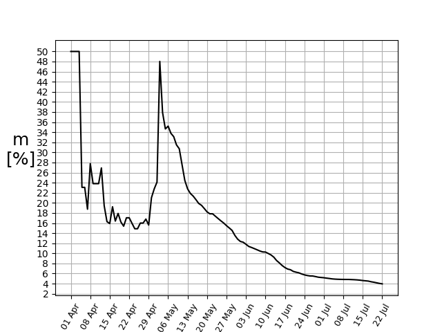
Using data till the 1st of July, the state stood in the fourth position amongst the states and UTs, with its m = 5.17%, comparable to the country-average of 4.72%. However, n explicitly takes the account that the number of tests have gone up significantly. Since the total population remains the same (for all practical purposes), this factor in the numerator is constant at all times. However, the denominator keeps increasing, resulting in a continuous decline of n.
The above arguments show that one single quantity can take into account the temporal evolution of a particular region and the geographical variation across different regions. However, it has a few caveats.
Caveats
Firstly, if in any particular region at any particular time or throughout a period, the testing rate is very poor, then deaths due to the disease itself may not be correctly asserted and go unreported. For example, if a person had SARS-CoV-2 and was not tested for COVID-19, but died due to it because of the sudden deterioration in health, then that death may not be counted as a COVID-19 death, reducing the apparent mortality ratio m, and hence n.
Secondly, the positive/negative binary is simplistic when it comes to diseases like COVID-19. Studies have shown that a large number of people have been asymptotically infected and cured. Studies have also shown that it is the viral load that determines a person’s chance of survival, not the binary yes/no answer. The binary answer itself, on the other hand, may depend on several factors. Whereas studies have shown that some patients test negative in one test and positive in a latter one, a recent study has also shown that asymptomatic and mildly asymptomatic patients of COVID-19 develop robust immunity to the disease.
Third, testing the whole population once may not be the sign of robust testing. In the middle of a pandemic, one might be required to be tested many times to rule out new onset of the disease. Moreover, those who have already been infected are tested at least twice, once in the beginning and once later. However, currently not even 1% of the population has been tested, hence the small number of repeat tests for uninfected patients is negligible. On the other hand, repeat tests for infected people is difficult to keep track of. In such a scenario, the ratio t indeed reflects the testing efficiency in a purely statistical sense.
The World
Keeping all these caveats in mind, I finally turn to a comparison between the different countries of the world. Since the list is too long, I consider data till the 1st of July 2020, from 23 countries with the highest number of confirmed cases (leading up to China). I also especially hand-pick all the neighbouring countries of India. Since the UK and Spain do not reveal the number of recovered cases (R), or the active cases from which it can be calculated, these two countries do not feature in the comparison despite having a large number of confirmed cases.
| Country | n | m |
| [%] | ||
| Mexico | 37.83 | 17.06 |
| Afghanistan | 25.16 | 4.71 |
| Myanmar | 18.41 | 2.63 |
| Japan | 14.88 | 5.50 |
| France | 13.23 | 28.06 |
| India | 7.20 | 4.72 |
| Pakistan | 7.07 | 4.18 |
| Bangladesh | 6.17 | 2.95 |
| Colombia | 4.84 | 7.40 |
| Brazil | 4.74 | 6.84 |
| Iran | 2.68 | 5.41 |
| Thailand | 2.15 | 1.86 |
| Italy | 1.71 | 15.43 |
| Canada | 1.54 | 11.28 |
| Sri Lanka | 1.27 | 0.63 |
| South Africa | 1.24 | 3.49 |
| Peru | 1.02 | 5.24 |
| The USA | 0.96 | 10.10 |
| South Korea | 0.95 | 2.37 |
| China | 0.89 | 5.58 |
| Turkey | 0.70 | 2.85 |
| Germany | 0.68 | 4.80 |
| Chile | 0.39 | 2.29 |
| Nepal | 0.35 | 0.65 |
| Saudi Arabia | 0.26 | 1.26 |
| Russia | 0.16 | 2.21 |
| Maldives | 0.05 | 0.46 |
| Qatar | 0.01 | 0.14 |
| Singapore | 0.01 | 0.07 |
| Bhutan | 0.00 | 0.00 |
Thus it is noticed from the above table that by considering data till the 1st of July 2020, amongst Indian neighbours, Afghanistan (25.16) and Myanmar (18.41) were hard-hit; whereas, Pakistan (7.07), Bangladesh (6.17), Sri Lanka (1.27), China (0.89), Nepal (0.35), and Bhutan (0.00) were better off.
Since the total number of recovered patients in the world as well as the number of tests done by all countries are not available, we cannot have a world estimate for n. However, we can calculate the world average m, using the same data. It turns out to be 8.03%. Notably, countries like France (28.06%), Italy (15.43%), Canada (11.28%), the USA (10.10%) have m worse than the world-average, whereas Germany (4.80%), India (4.72%), South Korea (2.37%) are better off according to this crude estimate.
An additionally important factor to consider is the number of confirmed cases per number of tests, c. If it is too high, it means a good number of symptomatically infected individuals exist amongst the population.
Conclusion
While acknowledging that a case-by-case investigation is necessary, and a gross parameter cannot even attempt to capture the complexity of a disease like COVID-19, one can still ask a statistical question “How do we compare different heterogeneous regions, or the same region at different times?” To which, the proposed ratio (n) provides a robust answer, reflecting the situation in a purely statistical sense.
Data sources
- Throughout this article, the data for India used has been obtained from the website https://www.covid19india.org/, which in turn uses the data from this source list. According to their FAQ section, “We are using state bulletins and official handles to update our numbers. The data is validated by a group of volunteers and published into a Google sheet and an API. API is available for all at api.covid19india.org. We would love it if you can use this data in the fight against this virus. The source list is here.”
- Throughout this article, the data for countries other than India has been obtained from https://www.worldometers.info/coronavirus/, please see their FAQ section for more information.
Acknowledgements
I acknowledge the careful comments of my friend, Navin Sridhar, in improving this piece as it stands now.
In case you want to collaborate further, feel free to get in touch.
